
Noir Elan: an identity from wordmark to signage.
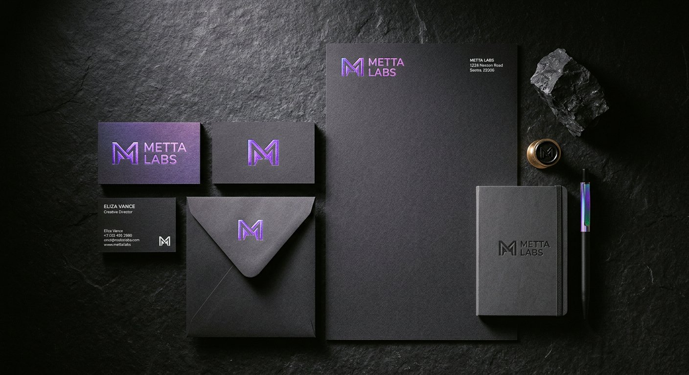
A fashion house identity system, built to hold up in boutiques, on packaging and on screens, with rules the client's own team can run.
01The story
How Noir Elan identity came together.
Noir Elan needed an identity that felt quiet and expensive at the same time, in a category that usually shouts. We built the system around a custom wordmark, a restrained palette and a type scale that stays elegant at label size.
The work went well past the logo: packaging dielines, label typography, signage specifications and social templates, all documented in a guideline the client's team applies without calling us. Print proofs were run with the brand's vendors before anything went to shelf.
A year later the system absorbed a sub brand and a seasonal collection without breaking, which is the real test of an identity: not the launch, but everything after it.
02Case
Noir Elan identity
A fashion house identity system, built to hold up in boutiques, on packaging and on screens, with rules the client's own team can run.
A fashion house launching into a crowded market needed quiet confidence, not another loud logo.
Custom wordmark, restrained palette and a documented type and layout system across packaging, signage and social.
A system the client's team runs daily, which later absorbed a sub brand without a redesign.
04Keep watching
Related work and services.
NextStart something
Tell us what you need in plain words.
A brief, a rough idea, or just a deadline. A real person replies within two working hours with what it takes and how long it runs.